A dashboard you can read at a glance
RentHunter helps people find housing in the Netherlands. A remote freelance assignment: redesigning the dashboard and the home page.
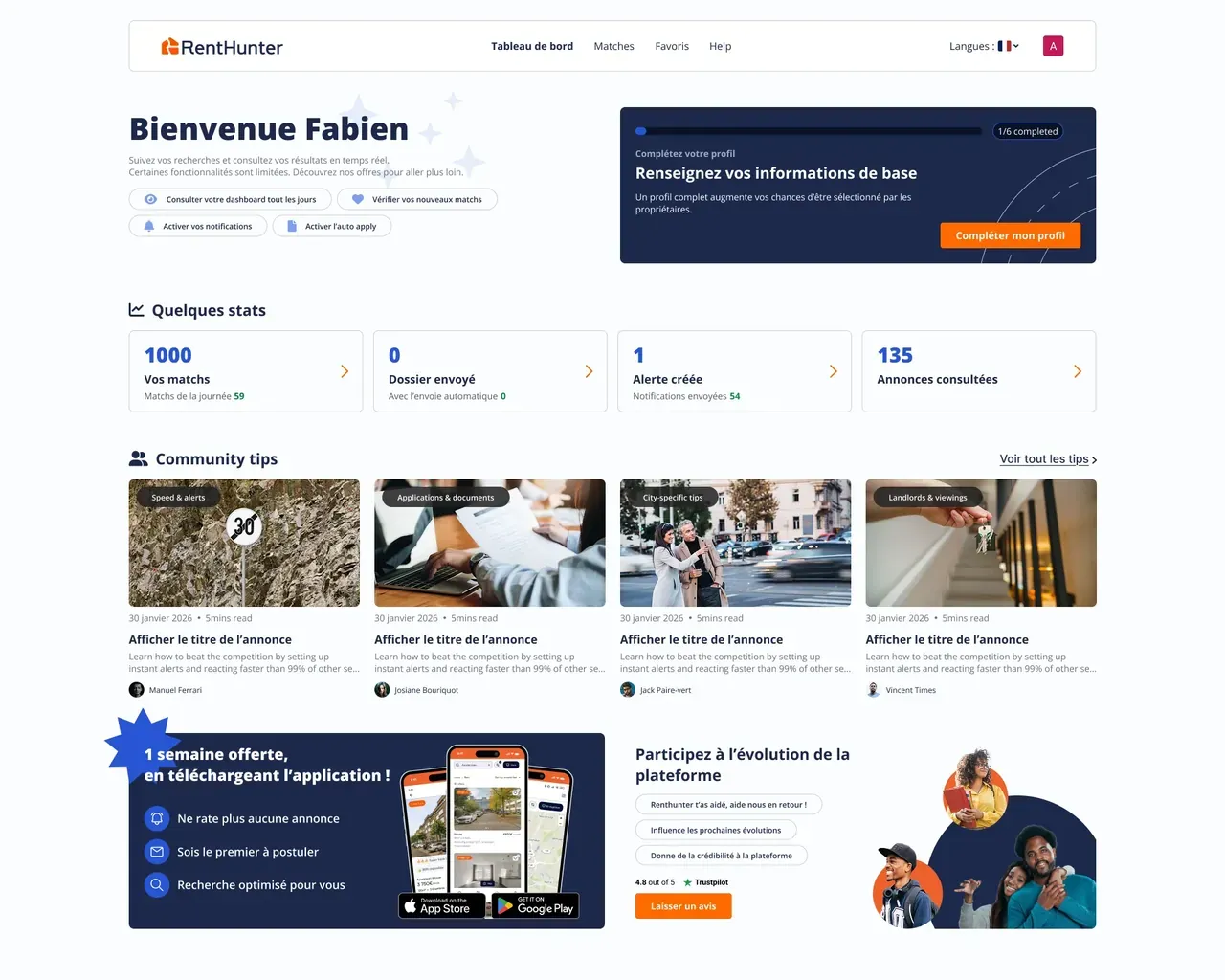
 AxelThe key figures of your search, as soon as you open it.AxelThe next step is highlighted: completing your profile.
The problem
The dashboard is the screen you land on every time you come back to the app. It was cluttered: you couldn't see at a glance where your housing search stood, and the main actions required a detour. The challenge: make it clearer and more useful, to support usage and engagement.
My decisions
Surfacing what matters when users come back
The information that matters when you come back to the app moves to the top: search progress, key figures and the next step. The main actions are reachable without a detour.
Designing mobile for real
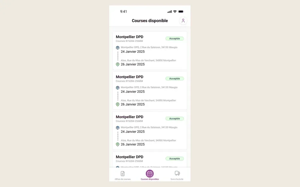
A mobile version designed for the small screen, with the same hierarchy as on desktop: search progress first. Not a shrunk-down desktop screen.

What changed
Progress visible the moment it opens.
A dashboard reorganized around this principle, on desktop and mobile. A remote assignment for a Dutch client.

What I'd do differently
I would have tracked usage of the new dashboard for a few weeks to check that it brought users back.
The 3 screens