Making a lawyer easy to find and book
Juridispo puts people looking for a lawyer in touch with lawyers. A freelance assignment within the Vertizontal collective: a UX audit, then the redesign of both journeys.
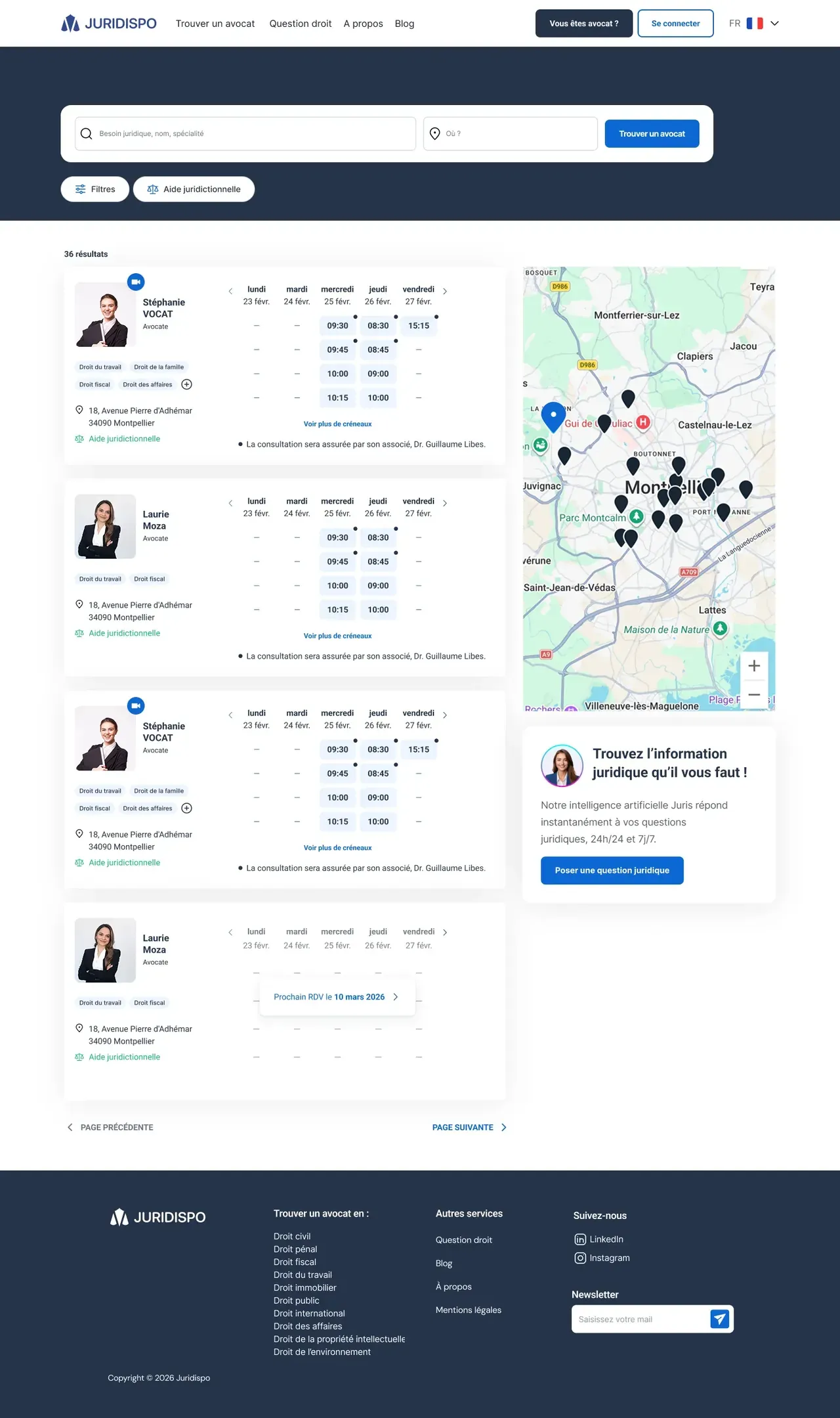
 AxelAvailable slots show up right in the list.AxelThe map shows where each firm is.
The problem
The audit revealed friction in the two main journeys: finding a lawyer, and signing up as a lawyer. Two audiences, two value propositions.
My decisions
Mapping the journeys before drawing anything
I formalized the user flows of the client looking for a lawyer and of the lawyer: every step, every exit point. The team aligned on the logic of both journeys before a single mockup.
Booking in five guided steps
Location (at the office or by video), type of consultation, duration, legal context with attachments, then log in to confirm. The appointment details stay visible alongside, at every step.
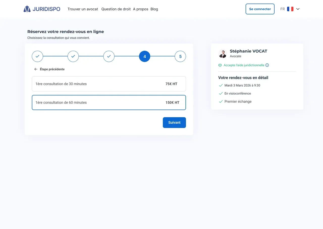 AxelThe summary follows the client from one step to the next.
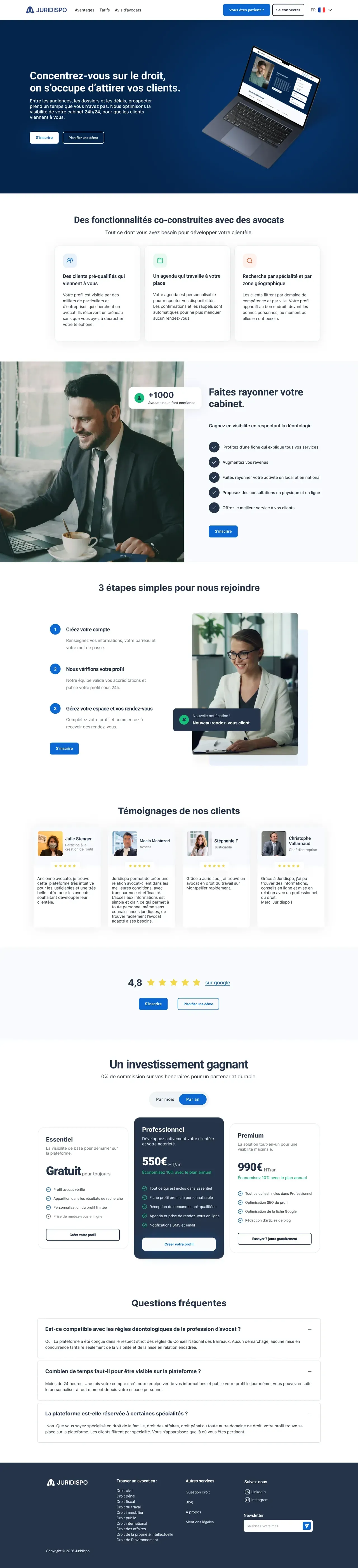
Two audiences, two entry points
For people looking for a lawyer: finding one. For lawyers: a home page that clarifies the offer and the three steps to join the platform, then a sign-up approved within 24 hours.
What changed
The diagnosis drove the redesign.
Every screen stems from a friction point found in the audit, from the home page to the booking funnel.

What I'd do differently
I would have tested the booking funnel with a few people looking for a lawyer before locking in the five steps.
The 13 screens